I’m sure you are like me in that you don’t enjoy receiving emails that don’t serve a purpose.
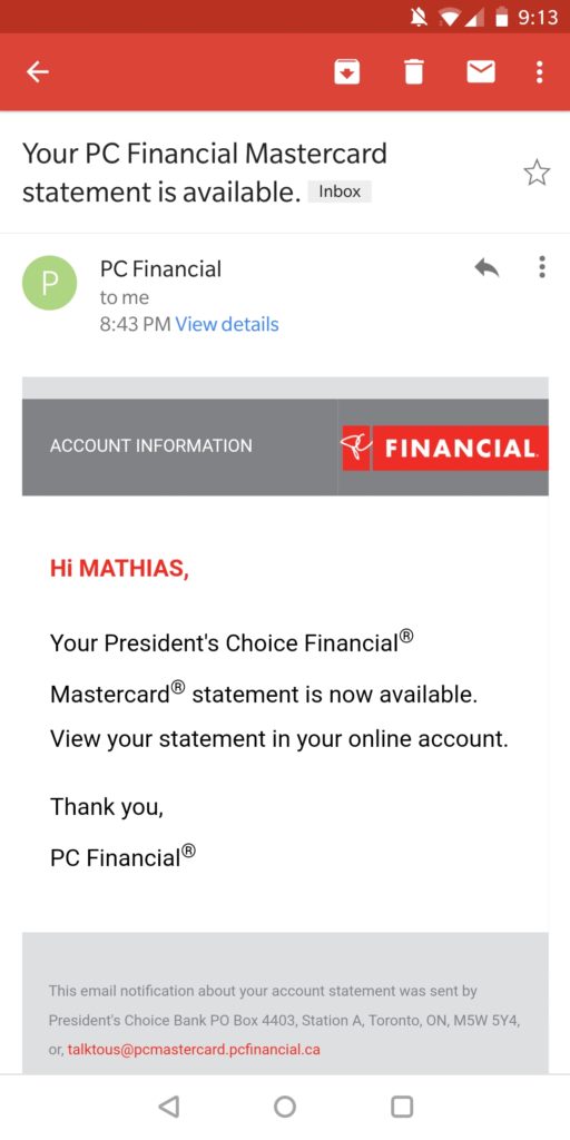
I recently received an email from PC Financial, my credit card, letting me that my statement was ready to view. Great. The only problem is that there is nothing for me to immediately do with this. There is no link for me to click through. There is no attachment with my bill nothing. Any utility this email had is now gone as me, the user cannot easily accomplish their goal.
I often wonder if the team creating these transnational emails really thinks about the end user experience because if they did, I think an email like this would look a whole lot different than what you see below.

Bad Transactional Emails